Fairy Angel

Fairy Angel is a brand specializing in handcrafted jewelry, inspired by the rich traditions of Greek artistry, particularly the intricate macramé technique. With a focus on luxury and craftsmanship, the brand needed a visual identity that would bridge the gap between its historical roots in Arcadia and a modern, sophisticated audience who values bespoke, handcrafted jewelry.

Brand Strategy

Visual Identity

Stationery Design

The Problem

Fairy Angel needed a brand identity that could simultaneously honor its deep roots in Greek artistry and appeal to a contemporary audience. The challenge lay in balancing tradition and modernity — creating a visual language that felt authentic and luxurious without appearing outdated or overly ornate. Without a cohesive identity, the brand risked blending into the saturated jewelry market, losing the unique story behind its handcrafted designs.

The Solution

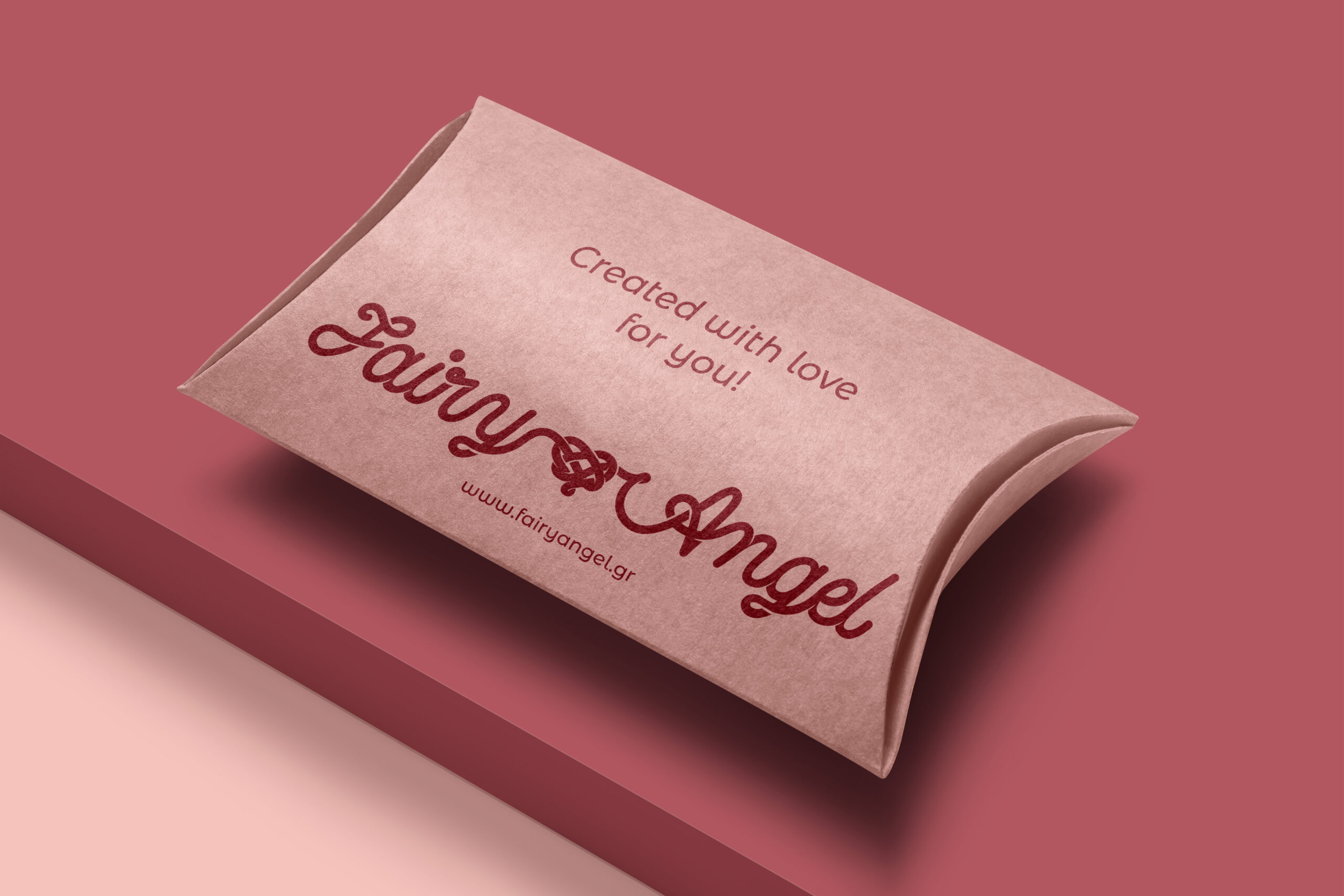
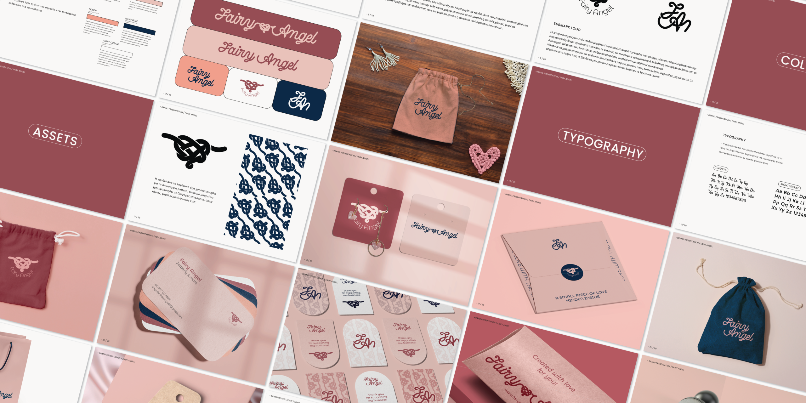
To bridge the gap between tradition and modern appeal, I crafted a visual identity that reflects Fairy Angel’s artisanal roots while feeling fresh and elegant. The logo, inspired by macramé patterns, became the centerpiece of the brand, symbolizing both craftsmanship and cultural heritage. I curated a soft, earthy color palette and intricate design elements that echoed ancient Greek artistry, creating a cohesive and luxurious brand experience across all print and digital touchpoints.

The Result:
Fairy Angel’s new brand identity beautifully merges the authenticity of Greek heritage with the elegance of modern handcrafted jewelry. The logo and print designs enhance the storytelling of the brand, helping it connect deeply with customers who value tradition and craftsmanship in the pieces they wear.